I felt that as the project continued we started to find an identity for this exhibit that we could, almost, all agree on. Which, when you have a class of 20 people, that is pretty awesome. I am so proud of our class for coming together in the end and pushing through to create a final product I think most people felt excited for.
Below are a few of our final designs. Going back to our original groups, we were able to narrow down on information and divide and concur. Being an XD, I wrote information for my particular group (Hard choices made in poverty), the copy seen below. It was wonderful working with Ella and Haylee for they are both very hard workers and easy to talk too. They are always willing to go above and beyond what is expected of them, and never once did they question what we had to do, they simply did it.
In our XD groups, not only did we write content, but user-tested the information. It went surprisingly well as our assumptions were, happily, not entirely true. We figured that people would not be that knowledgable in the field of poverty, but all three that we interview, were. They were just unfamiliar with poverty in Douglas County.
We set up full scale posters, and had them fill our a questionnaire before and after they read the information to see what they had gained from it. Here was an example:
We learned from our test that we needed to be clearer in our information, and a little more precise about how the viewer was to interact with our exhibit.
There also needed to be an emotional take-away. A reflection or call to action. Even though we addressed this, after talking with Erika, the class found that we may have needed to spend more time on the call to actions. This was good to hear. There is always room to improve, and if our group's direction is chosen, it will be exciting figuring out just what to say.
Friday, October 30, 2015
Group #3
For the second stage of this project, we broke up into three secondary groups to narrow down on a graphics direction using the information pooled by the original teams. We approached this by looking into the audiences needs and our perception on what would be the best way to show the information We ended up relying on materials and services we could get at the design school, such as wood, the laser cutter and letterpress.
Here is a bit of the presentation we put together for our class (below). I worked with Michelle M. to create the section dealing with health and poverty. She was wonderful to work with as her extra research allowed for us to experiment with our yarn idea, having the viewer follow the life of a person in or out of poverty. (explaining how health effects us all and can lead to financial strain.) I used her information to then create the visual look, basing it off of our groups mood-board.
I created each of the photoshop mockups shown below, imposing the documents and posters onto the photos.
Here is a bit of the presentation we put together for our class (below). I worked with Michelle M. to create the section dealing with health and poverty. She was wonderful to work with as her extra research allowed for us to experiment with our yarn idea, having the viewer follow the life of a person in or out of poverty. (explaining how health effects us all and can lead to financial strain.) I used her information to then create the visual look, basing it off of our groups mood-board.
I created each of the photoshop mockups shown below, imposing the documents and posters onto the photos.
Social Change
I love projects that focus on social change, impacting the community though graphic design. This is why I thoroughly enjoyed our project working with the United Way to help people understand Poverty in Douglas County. To me, graphic design is not just a means to a pretty poster, it is a tool we can use to better society.
I then worked within a smaller group that focused on "hard choices made by those in poverty." And I was amazed at what we found. Perhaps my favorite part about this project was the research. I learned more about this subject than I ever would have on my own. And for that I am grateful.
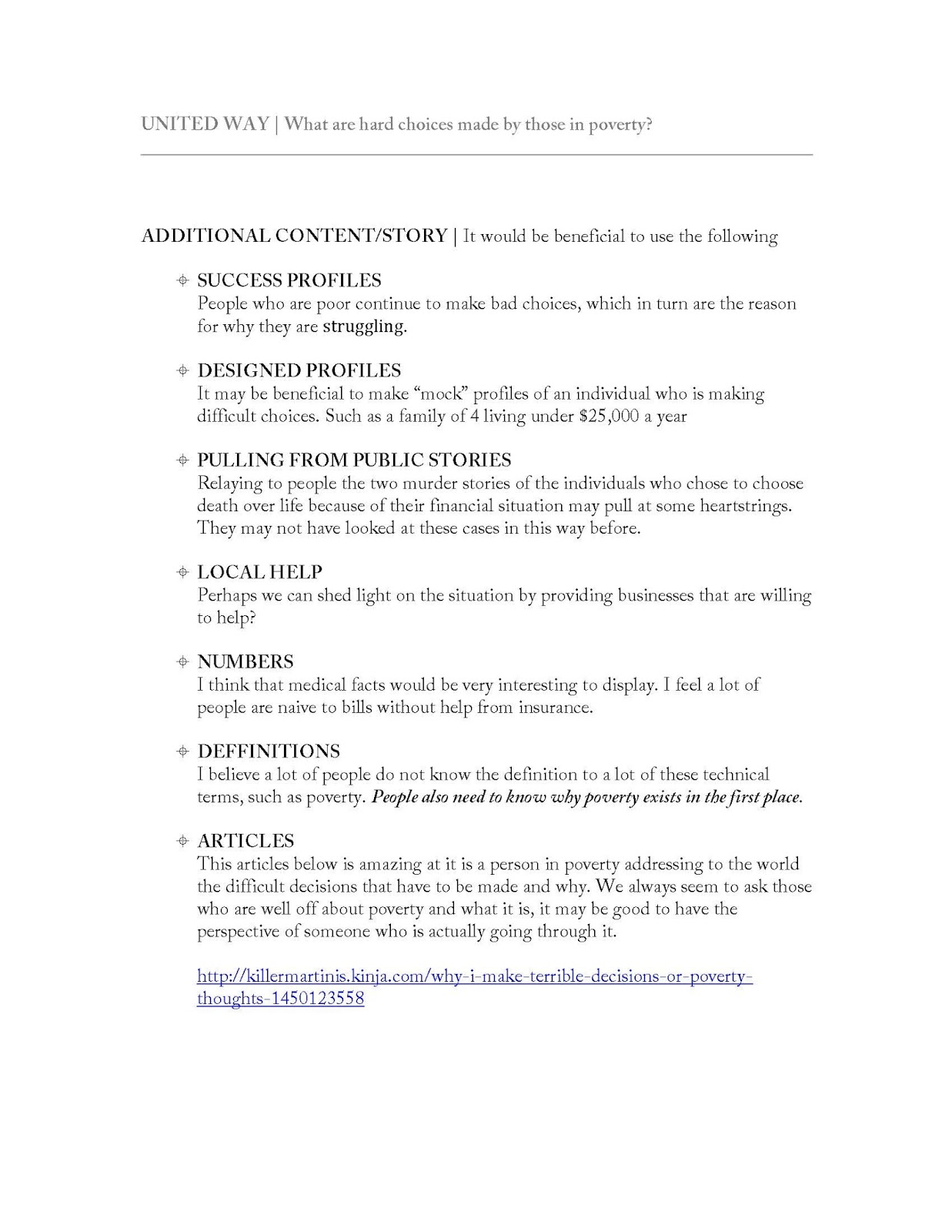
This is the initial information that I researched for our group:
Wednesday, September 9, 2015
Design Direction
After looking into other design options, I have decided to go in the following direction. I feel that the wood ties in nicely with the concept of playing cards, being that they are typically a table top game. I have used a pattern from a card to also clarify the idea of playing cards.
Wednesday, September 2, 2015
Visual Directions (Ideas)
Here are a few visual ideas I am going to pursue. I prefer the first and third options. I want it to feel organic.
NOTE: the images and pictures currently shown are not of my work. These are just ideas that I will then personally create to formate the exact feel.
Final Wire Frame and Site Map
For my final wire frame and site map, I have decided to go with the following designs. After talking with others about the previous options, I feel that I can best visualize this design and have a planned out idea in my head.
I am excited to see where this takes me
Friday, August 28, 2015
Wire Frames
I enjoyed working on Wire Frames for the project. I feel that these will be extremely helpful when designing our websites in Muse. They are your basic sketches, leading you to your final product. As of now, these do not need to be elaborate. They are but guidelines, but they reflect the basic needs and wants I have for my website. Bellow are three different wire frames:
This wire frame follows Site map #2 (previous post, last image). After clicking on a button it takes you to a different page.

The following wire frame follows Site map #1 (previous post, second image). These pages can be scrolled and are not restricted to the screens dimensions (800x600, shown by the line breaks identifying the end of the screen hight). Similar to the first wire frame though, after you click on a button, you are taken to a new page that can also be scrolled.
The last Wire frame is different than the rest as it is one continuous page. When you click on a button, it automatically scrolls you down to the point you would like to be taken to. The navigation bar would have an anchor to it where no mater where you scrolled, it would be at the top of the screen, always. It too follows Site map #1 (previous post, second image)
This wire frame follows Site map #2 (previous post, last image). After clicking on a button it takes you to a different page.

The following wire frame follows Site map #1 (previous post, second image). These pages can be scrolled and are not restricted to the screens dimensions (800x600, shown by the line breaks identifying the end of the screen hight). Similar to the first wire frame though, after you click on a button, you are taken to a new page that can also be scrolled.
The last Wire frame is different than the rest as it is one continuous page. When you click on a button, it automatically scrolls you down to the point you would like to be taken to. The navigation bar would have an anchor to it where no mater where you scrolled, it would be at the top of the screen, always. It too follows Site map #1 (previous post, second image)
Subscribe to:
Posts (Atom)